Friday, December 2, 2011

Across the Valley. 8"x20". Oil on linen (mounted to board).
Contact me for price and availability.
Hello!

It seems that each time a season gives way to the next, the variety in both color and patterns is increased tenfold!...summer turns to autumn in the above painting, with greens interspersed with oranges, tans, and pinks. And in the 3 paintings below, the snow allows me to put those beautiful light blues and purples against the oranges and warm browns of the other elements. The dramatic changes that come with the changes of seasons always excite me...I feel I can't work fast enough, but each year I manage to capture something of importance about each seasonal change, so eventually I should have quite a collection under my belt.

Please enjoy! -Trent

Iced-Over Canal. 10"x8". Oil on linen (mounted to board)
Contact me for price and availability.

Old Park City, Winter. 12"x16". Oil on panel.
Contact me for price and availability.

Park City Alley. 8"x10". Oil on linen (mounted to board)
Contact me for price and availability.


Contact me via email at : trent@trentgudmundsen.com or call me at (435) 752-3316

Visit my website: www.trentgudmundsen.com

Wednesday, November 30, 2011

Painting Clouds That Look Like Clouds

An artist friend just asked a great question. She says,
 "I've been working on a landscape and having a terrible time with a couple little clouds I'm trying to paint. Do you use a special brush when you paint clouds? I'm wondering if I just need to wait awhile and let the darker shades dry so the lighter areas don't end up muddy. I can't figure out how to get a fluffy airy look".
Clouds really can be hard, and it seems sometimes that the more you work on them, the worse they get. Luckily, there are indeed some things to do that will help, including a trick or two. But let me first break down the question into parts.

Do you use a special brush when you paint clouds? It sounds like it would make sense to use a soft brush when painting soft clouds, but that can actually (sometimes) work against you. Contrary to what you may think, soft brushes are oftentimes best reserved for sharp lines and detail work, while the stiff bristle brushes can be great for soft, wispy edges. In general, I just use my large bristle brush (same one I use in the rest of the landscape), and have found that one to work better than anything.

I'm wondering if I just need to wait awhile and let the darker shades dry so the lighter areas don't end up muddy. This can sometimes seem like the right thing to do, but I personally prefer to paint cloud/sky areas wet into wet...it helps with the softer edges that you'll want. No, I think the best thing to do is scrape down any paint that's gotten too thick, then repaint the clouds the way you want them, remembering that clouds are 3-dimensional structures with a light side and a shadow side.

I can't figure out how to get a fluffy airy look. In my experience, clouds usually begin to look too "heavy" for one of two reasons: first, the sky is painted too dark in comparison to the clouds (or the contrast within the clouds is too great); and second, the edges are simply too hard/sharp (which can sometimes be because the paint is too thick). Without seeing my friend's painting, I'm going by what problems I've run into.

Now, a couple tricks that may help:

  • Paint the clouds first, then the sky. If you're like me and enjoy an impressionistic or painterly look, this is practically a rule. I can't tell you how often I've been surprised by how well this simple trick works. (If you've already painted the sky, that's fine...repaint the clouds the way you want them, then go back in with the sky color and paint around them). Then you can soften an edge here and there, mixing the sky and the cloud tones together a bit to create half-tones.
  • Look carefully at the shadows within the clouds. Except for dark storm clouds, the shadows within the clouds are usually going to be lighter than the sky around them.
  •  To see how soft or hard the edges are, try to blur your vision a little and see how soft the clouds are compared with the land and other elements in the landscape you're painting. With big thunderclouds it's easy to think they have hard edges...well, they kind of do, that is, until you see how soft they look compared with the edges of the trees and grass (which are also soft elements, but not nearly as much as the clouds above).
  • When you need to soften the edge of a cloud, I would suggest not "feathering" the edges. I've seen it done well this way, but it's sometimes easier to preserve the form and mass of the cloud if you paint the obvious shape of it, only using those half-tones I mentioned (mixtures of the sky color and the cloud color...and here it's easiest to drag from cloud to sky, or from sky to cloud).
(Notice here that the shadows are far lighter than the sky).

(Very wispy clouds can be very difficult to paint. Just remember that they still have form and shape).


As for a step-by-step order, although I suggest finding your own way that works in each painting, here are some steps that may help:
  1. First, paint the clouds white (or rather, the correct color-corrected version of white...meaning that you warm it up or otherwise color it a bit according to what you see)...just worry about the outline shapes first, kind of in construction paper fashion, .
  2. Without cleaning your brush first, mix an ever-so-slightly-darker shade for your cloud shadows, making sure again to look at your subject and make it the right temperature (usually warmer than you might think, and always warmer--and usually lighter--than the sky around it).
  3. Wash your brush thoroughly and paint in the sky color around your clouds...like magic, it will all come together. 
  4. Finally, soften your edges, paying close attention to preserving the shape and form of the clouds...don't overdo it.
Hope this helps. If you need extra help, ask away. :)
-Trent

Click here to go to my website and see some more examples.


Wednesday, November 3, 2010

Some notes from my visit with a master landscape painter!


You've probably never heard of VaLoy Eaton, but he's probably one of the greatest landscape painters alive in the world today. Of course, this is my own opinion, but to back up my claim, VaLoy won (among others) 3 Silver Medal Awards at the National Academy of Western Art (now Prix de West) annual shows, and is pretty much the go-to-guy for many large corporate landscape art needs, (especially in Utah, which is his home and therefore his chosen subject most of the time).

And why haven't you heard of him?...well, as he puts it, it's really easy to become famous, but it's a lot tougher to stay famous. More to his credit, he also admits that he doesn't "need" to be famous anymore (he's paid off his house, studio, vehicles, etc., and is doing as well as ever with his art sales....so there you go; I would tend to agree with him).

Anyway, why do I bring up his name? Well, because VaLoy Eaton is one of those little-known (except to his many eager collectors) masters of fine art who has a treasure trove of wisdom and experience to impart to those who are lucky enough to be the recipients, and I'd like to ensure here that his wisdom is not forgotten....

But first a little background story. I was lucky enough to meet VaLoy when I was only 12 or so, when I was able to go to his studio for occasional critiques, pointers, and general inspiration and encouragement for the next 8-10 years. I don't know if I realized at the time how lucky I was.

To make a long story short, much of my artistic philosophies and habits are a direct result of the things he told me over the years. To make the story even shorter, I had the wonderful opportunity a few weeks ago to visit with him again at his new studio (it's been about 10 years since our last meeting). Not only was this a happy reunion of old friends, but it was a familiar reminder of tried-and-true methods and wisdom (things I had heard from him years ago, but had either forgotten or misunderstood).

OK, now on to some of the things he taught me (in "note" format, and in no particular order):

1) Regarding composition, don't follow any rules, charts, or graphics (including one book that tends to be seen as a "bible" of composition)...instead, just make sure you create interesting SHAPES, COLORS, LIGHT, AND SPACE.

2) Don't follow any "rule of 3rds" or any other such rule. Just make sure that your painting has one subject, and one "story" to tell. If you tell that story, then it's a success.

3) ...and in case you didn't see the pattern in the first two points: No rules at all...forget them ALL! The "rules" were made up by non-artists to explain what the artists did.

4) Push color when you can, but keep it honest. In other words, see if you can pick out colors that you didn't notice at first. Also push atmospheric perspective as much as you can (which is when things get progressively lighter and (usually) bluer as they recede into the distance)...this one is "hard to overdo" as VaLoy put it.

5) Make sure your value shifts from light to dark aren't too great...create much of the change with temperature shifts instead of value differences.

6) Make sure everything has a color (temperature) to it, instead of being just gray. Likewise, make sure your temperatures are correct and consistent in your lights vs. shadows.

7) If your painting could be cut into two good paintings, maybe it should be. (This goes back to number 2 on this list, regarding only telling one story with one main subject in each painting).

8) Be picky when putting your work online or in galleries. Don't be too eager to get work out there.

9) "Not every painting can be a "10", but you shouldn't let anything below an "8" be seen by anyone". Be sure that you've not let any sub-par paintings out of your studio...they will continue to haunt you for years.

10) Look at masterpieces as often as you can (many great works of art can be found online and can be printed out for easy perusing in the morning or before bed). This is the single most important thing you can do as an artist. This practice will fine-tune your good taste, and your eye for what is good. (If I could interject, I might suggest John Singer Sargent, Anders Zorn, Joaquin Sorolla, Alfred Munnings, Isaac Levitan, Ilya Repin, John William Waterhouse and Nicholai Fechin as some good masters with whom to start).

11) Please yourself (and your creator) first. Don't listen too much to what others are saying about your work, unless you happen to already agree.

12) DO YOUR SUBJECT JUSTICE. Don't let any subject wish it hadn't been painted. Spend the time necessary to make it right (regardless of your style, each painting should properly capture your subject's personality)...(I could expound more on this one for a long time, but I'll instead let you just ponder its' meaning for awhile...it's worth writing on your easel just so it sinks in over time).

13) This one may be obvious, but much harder to do than to say: Never knowingly leave anything wrong with your painting. (Kind of goes hand in hand with "doing it justice").

May I wrap up this little list with another quote, by Velasquez: "Imitate nothing or nobody; paint all people and things as you see them."

I believe there's a lifetime of knowledge here (even though this list is in no way exhaustive). But as we know, with great (ahem) knowledge comes great responsibility (where have I heard that before?)...so, use it well to create better art! :)

By the way, VaLoy's website is: www.valoyeaton.com ...be sure to check it out!

Happy painting.
-Trent

You may be interested in seeing a few of my own landscape paintings on my website: www.trentgudmundsen.com ...(they're not as good as VaLoy's, I would venture, but I believe I've done the subjects justice and implemented a few of the things I've mentioned here).

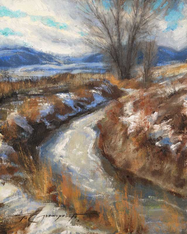
Here is one small example (a plein air piece, finished up in the studio).

Thursday, January 7, 2010

Brother's Keeper, 36"x24", oil on linen.


I'm really excited about this, my newest painting. The subjects are my daughter and my newest son...I can't help but be excited about a picture of my kids, but I think it's also kind of a groundbreaking painting for me.

Tuesday, November 24, 2009

Peer critiques

Yesterday I had the fun opportunity to join a few of my peers for a group critique session (actually, all three of them are substantially further along in their careers, which made it even more important for me). The group met at Mike Malm's amazing new studio. It was quite helpful to get the group's consensus on problems I was facing in my own paintings (it was equally helpful to hear why they felt other paintings worked well). Also helpful to me was to hear and offer critiques on the works of the others involved. Needless to say, it was a fun and very valuable experience, and I look forward to next time.

Friday, September 25, 2009

Small outdoor paintings

I've been having a great time painting outdoors for the past few months...it's a habit I've forgone for far too long. When I've done it, I've always found plein-air (outdoor, on location) painting to be the most rewarding type for me. Here's an example of a finished plein-air painting below (this one measure 8"x10")...this was painted on a relatively warm morning just a few weeks ago, in late August. It depicts the Blacksmith Fork River in Cache Valley, Utah as it runs near my home.


Please view my new paintings, including these small ones, on my website's "paintings" page:
www.trentgudmundsen.com/paintings.html

P.S.-

These small paintings are currently available direct from the studio.
8x10's are $900.00,
9x12's are $1,100.00, and
11x14's are $1,270.00...feel free to ask about other sizes.